Core nue concepts
Creating rich, interactive content with Nuemark
Nue uses a Markdown dialect called "Nuemark" for content editing. It lets you craft all sorts of web content like the front page, other marketing pages, documentation entries, and blog entries. You'll move faster by using your time on content and not on writing HTML or JavaScript:
Nuemark syntax takes inspiration from Wordpress shortcodes, TOML configuration language, and other Markdown elements. With Nuemark your content is more accessible to content creators and other non-technical people. They can craft new pages without ever leaving the content.
Custom tags
Nuemark extends standard Markdown with custom and built-in components or "tags". Here's a simple [image] component in action:
// named "src" option
[ src="hello.png"]
// unnamed option
[ hello.png]
// YAML options
[]
caption: Hello, World!
src: hello.png
// content option
[.]
This is a pure content argument, accepting
*formatting* and other Nuemark tags
// classes and ID
[#hero.epic.bordered hero.webp]
// cute shortcut for image, icon, and video tags
[! hello.png]Components are defined on a new line and are wrapped inside square brackets. They start with a tag name ("image") followed by one or more arguments. The arguments have a name and value (width="500") and the default argument can be unnamed (hello.png). The default argument is specific to a component.
Class names and id
Class names and id can be provided with #id.foo.bar notation after the component name:
[#hero.epic.bordered hero.png]All components support the this notation.
Complex arguments
You can alternatively supply the data in YAML format:
[.tall loading="eager"]
caption: This is the image caption
srcset: planet.png 450w, planet-big.png 900w
sizes: (max-width: 600px) 450px, 900px
alt: This is the alt textThe data must be indended right after the tag. You can mix both inline arguments and YAML data. If you are familiar with Markdown front matter, you should feel at home with configuring your components with YAML.
The ! alias
The [image], [video], and [icon] can alternatively be defined with a short-form ! alias:
[! hello.png]The component implementation depends on the file extension. Video formats, like .mp4 use the video component and image formats like .jpg and .webp use the image component, and icon component is used when there is no extension. For example:
[! star]Content blocks
Components can also accept content in their body. For example, our image component accepts inline Markdown within the body, which becomes the caption for the image:
[! hello.png ]
  This content block goes under a nested <figcaption> element.
  Inline *formatting* is supported.
Sometimes the block just acts as a content wrapper with a class name in which case the component name can be omitted:
[.]
This is a content block with nested *Nuemark*
[! hello.svg]Stacks and grids
The content of a component can be split into blocks with ---
[.]
---
---
The above generates this HTML:
<section class="cards">
  <div><h2>First content block</h2></div>
  <div><h2>First content block</h2></div>
  <div><h2>First content block</h2></div>
</section>
Use semantic class names like "stack" or "grid" to create layouts with any amount complexity using CSS flexbox, grid, and the :nth-child selector. A selector such as .cards > div can give the individual items a desired look.

Modern CSS is an undervalued powerhouse for styling semantic elements. Especially with Lightning CSS, which lets you use native CSS nesting and color functions today. Nue starts using Lightning CSS automatically if you run the following inside your project directory:
bun add lightningcssSections
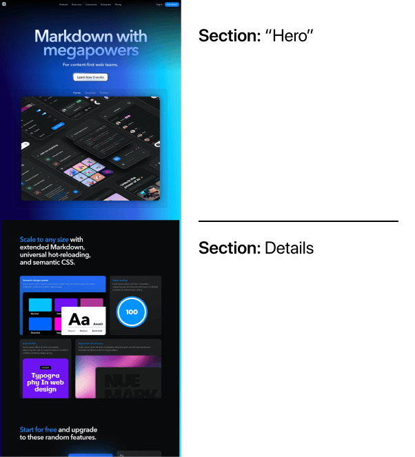
Just like books can be divided into chapters, web pages and blog posts are often divided into sections. For example, eht Nuemark demo application is separated in two: a "hero" section, and the rest of the page:
You can separate sections with three dashes (---) on the root-level:
# Hero section
Describe the hero of the article

--

## Second section
Describe something else
The above results to following HTML:
<section>
  <h2>Hero section</h2>
  <p>Describe the hero of the article</p>
</section>

<section>
  <h2>Second section</h2>
  <p>Describe the hero of the article</p>
</section>
Horizontal lines
You can render horizontal lines with ___, *** or - - -.
Nuemark reserves three hypens (---) for sections because it is already used to separate the front matter from the rest of the document. There is less things to learn and remember when using the same notation.
Section class names and id
You can provide class names and id for sections with #id.foo.bar notation after the separator:
--- .featuresYou can alternatively define sections in the front matter:
sections: [.hero, .features]Of course, the section definitions can also be given globally in site.yaml or folder level in app.yaml.
Interactive components
Some of the components, like [tabs] are progressively enhanced with standard Web Components.
[ "First | Second | Third"]
With full Nuemark support
[! image1.webp]
---
[! image2.webp]
---
[! image3.webp]Interactive components work out of the box with Nue framework. Check Nuemark API docs to get the Web Components working outside Nue.
Custom components
You can define custom components on the layout.html file on root level or app level. For example:
<form ="contact-form" action="/api/people">
<h4>Your name</h4>
<input type="text" name="name" placeholder="Example: John Doe" required>
<h4>Your email</h4>
<input type="email" name="email" placeholder="your@email.com" required>
<p><button>Join list</button></p>
</form>After this you can use it on your Markdown like any of the build-in tags:
[#contact.overlaid]Markdown extensions
Nuemark extends standard Markdown syntax as follows:
Header IDs
Nuemark outputs headers (h1, h2, h3) with a nested anchor tag. For example ## Hello is rendered as:
<h2 id="hello"><a href="#hello" title="Hello"></a> Hello</h2>This allows better styling and achoring of headers. Similar to what you can see on this page for example. You can customize the id with {# custom_id } suffix. For example:
## Building content-first applications with Nue { #content-first }Reference links
You can define reference links or "reflinks" anywhere inside the page. Links defined on one section work on any other section. For example:
Check out the [great divide][divide]

--

[divide]: //css-tricks.com/the-great-divide/ "JS devs vs UX devs"
You can also define site-wide reflinks on site.yaml, application level links in app.yaml, and page level links on the front matter using the links property. For example
# site.yaml: these reflinks works on all pages
links:
  issues: //github.com/nuejs/nue/issues "Nue Github Issues"
  divide: //css-tricks.com/the-great-divide/ "JS devs vs UX devs"
  front: //bradfrost.com/blog/post/front-of-the-front-end-and-back-of-the-front-end-web-development/
Note
Nue hot-reloading updates the page correctly no matter where the reflink is defined.
Fenced code blocks
Fenced code blocks can be extended with language-name#foo.bar notation. For example:
``` html.bordered
<!-- My code goes here -->
```
Will pass "html" for the underlying code highlighter and the wrapper looks like this:
<pre class="syntax-html bordered">
  ...
</pre>
Note
A Nue-optimized syntax highlighter will be released on the next version of Nuemark.
Line comments
Line comments are prefixed with //
// This line is a comment and thus not rendered
# Hello, World