Tutorial: Building websites with Nue
This tutorial guides you through creating a simple Markdown-based blog with Nue, a framework that harnesses web standards for content-focused websites. You’ll build a lightweight personal blog, learning how Nue keeps content, structure, and style separate while adding interactivity where needed.
Start by installing Nue — see the installation guide. Then, set up the demo:
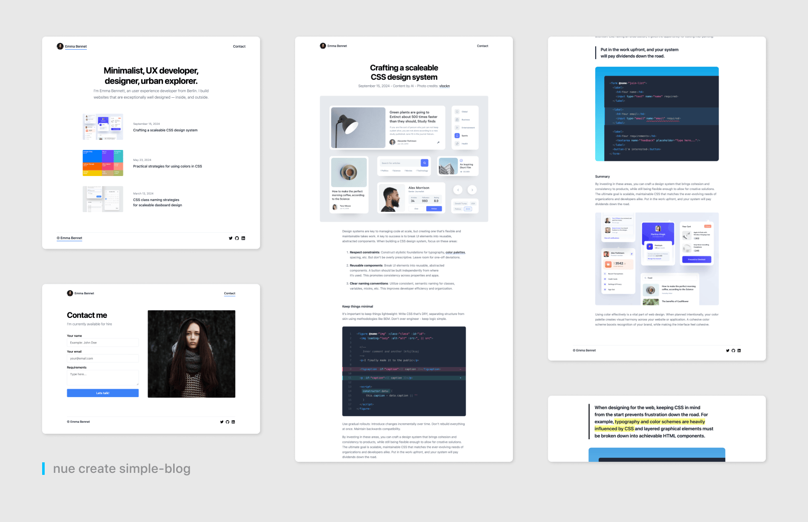
nue create simple-blogRun it, and open http://localhost:8083 in your browser to follow along.
Project structure
Nue organizes your blog into a directory structure that separates content, layout, and styling, reflecting what appears online. This keeps everything clear and manageable. Here’s the layout:
/
├── # Global styles and layouts
│ ├── colors.css # Design system: colors
│ ├── layout.css # Core layout styles
│ ├── layout.html # Header and footer templates
│ └── typography.css # Typography scale
├── blog # Blog content area
│ ├── blog.yaml # Blog settings
│ ├── index.md # Blog listing page
│ └── hero.html # Blog post header template
├── img # Images and icons
├── index.md # Front page content
└── site.yaml # Global settingsThe @global folder holds reusable pieces for the whole site. The blog folder is where posts and blog-specific files live. The index.md file is your homepage, and site.yaml ties it all together with settings.
Content
Nue stores blog content in Markdown files, making it easy to write and update. Let’s explore how this works.
Site metadata
The site.yaml file sets up metadata for the entire site:
title_template: "Emma Bennet / %s"
og: /img/og_emma.png
author: Emma Bennet
favicon: /img/favicon.jpg
This defines how page titles appear (e.g., “Emma Bennet / Blog”), adds a social sharing image, and sets a favicon — basic details for SEO and branding.
Blog posts
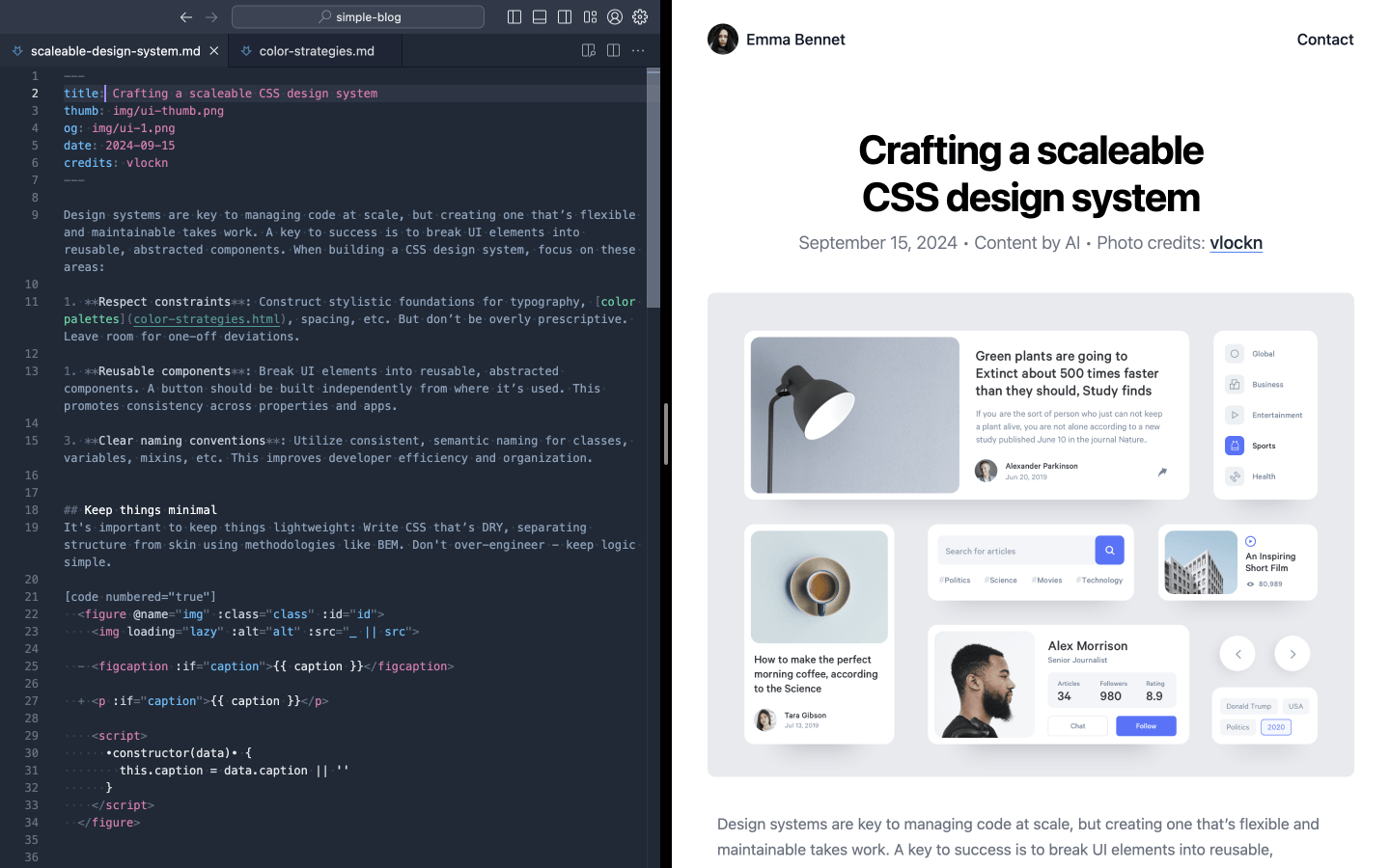
Posts are Markdown files in the blog directory. Here’s a sample, like blog/post.md:
---
title: A standards first framework
description: Taking HTML, CSS and JavaScript to their peak
date: 2024-01-15
---

Content starts here...
The front matter at the top provides metadata — title, description, date — that Nue uses to display the post. The Markdown below is the content itself.
Content collections
The blog’s listing page, blog/index.md, shows all posts with a collection. Set it up in blog/blog.yaml:
content_collection: postsThen use it in blog/index.md:
[]The [page-list] tag pulls every post from blog/, sorting them by date — newest first. It’s a quick way to keep the list up to date.
Hot reloading
Change a post — like its title — and save. Nue’s hot reloading updates the browser instantly, keeping your workflow smooth without manual refreshes.
Layout
Layout modules are HTML files that define the blog’s structure, wrapping around your Markdown content for consistency.
Site-wide layout
The @global/layout.html file provides a header and footer for all pages:
<header>
  <navi :items="navigation.header"/>
</header>

<footer>
  <navi :items="navigation.footer"/>
</footer>
The <navi> tag builds navigation from site.yaml:
navigation:
  header:
    - Emma Bennet: /
    - Contact: /contact/
  footer:
    - © Emma Bennet: /
    social:
      - image: /img/github.svg
        url: //github.com/nuejs/
        alt: Github Projects
This keeps navigation simple and centralized. See layout.html for more on slots.
Blog post layout
Each post gets a header from blog/hero.html:
<header ="pagehead">
<h1>{ title }</h1>
<p>
<pretty-date :date="pubDate"/> • Content by AI
Photo credits: <a href="//dribbble.com/{ credits }">{ credits }</a>
</p>
<img :src="og" width="1000" height="800" alt="Hero image for { title }">
</header>It uses the post’s front matter to fill in details, sitting above the content.
Styling
Styling adds visual polish with CSS, kept separate from content and layout for flexibility.
Global styles
In site.yaml, global styles are included:
globals: ["@global"]
libs: ["@library"]
The @global/layout.css file styles the page structure:
body {
  max-width: 1000px;
  margin: 0 auto;
  padding: 2% 5%;

  > header nav {
    justify-content: space-between;
    margin-bottom: 4rem;
    display: flex;
  }

  > footer {
    border-top: 1px solid var(--gray-200);
    justify-content: space-between;
    margin-top: 6rem;
    display: flex;
  }
}
This aligns with a design system — see design-systems.html.
Component styles
The blog adds specific styles in blog.yaml:
include: [ content, cards, motion ]These handle content formatting, post cards, and animations.
Interactive islands
Islands add interactivity with custom tags, enhancing static content using a 2.5kb runtime.
Contact form
Here’s the island from the demo, in contact-me.htm:
<script>
import { loadPage } from '/@nue/view-transitions.js'
</script>
<form ="contact-me" .prevent="submit" autocomplete="on">
<label>
<span>Your name</span>
<input type="text" name="name" placeholder="Example: John Doe" required>
</label>
<label>
<span>Your email</span>
<input type="email" name="email" placeholder="your@email.com" required>
</label>
<label>
<span>Requirements</span>
<textarea name="feedback" placeholder="Type here..."></textarea>
</label>
<button>Let's talk!</button>
<script>
submit() {
loadPage('thanks.html')
}
</script>
</form>Add it to index.md:
Get in touch to discuss your project.
[]It submits and navigates to a “thanks” page with a transition. See islands.html for details.
Motion
Motion enhances the blog with CSS, keeping it lightweight.
View transitions
Enable them in site.yaml:
view_transitions: trueStyle them in @library/motion.css:
article {
  view-transition-name: article;
}

::view-transition-old(article) {
  transform: scale(1.2) translateY(2em);
  transition: .8s;
}
This smooths page changes without JavaScript.
Optimization
The blog stays fast with inline_css: true in site.yaml, loading CSS upfront. It works without JavaScript, and images load lazily.
Deployment
Build for production:
nue build --productionFiles end up in .dist/prod, ready for a CDN like Cloudflare. Try adding more with multipage applications.