Styling
Nue uses CSS as the primary tool for styling. Your job is to create a design system. Here we focus on styling, specifically on content-focused apps.
Global styles
Global directories are defined in your site.yaml configuration file as follows:
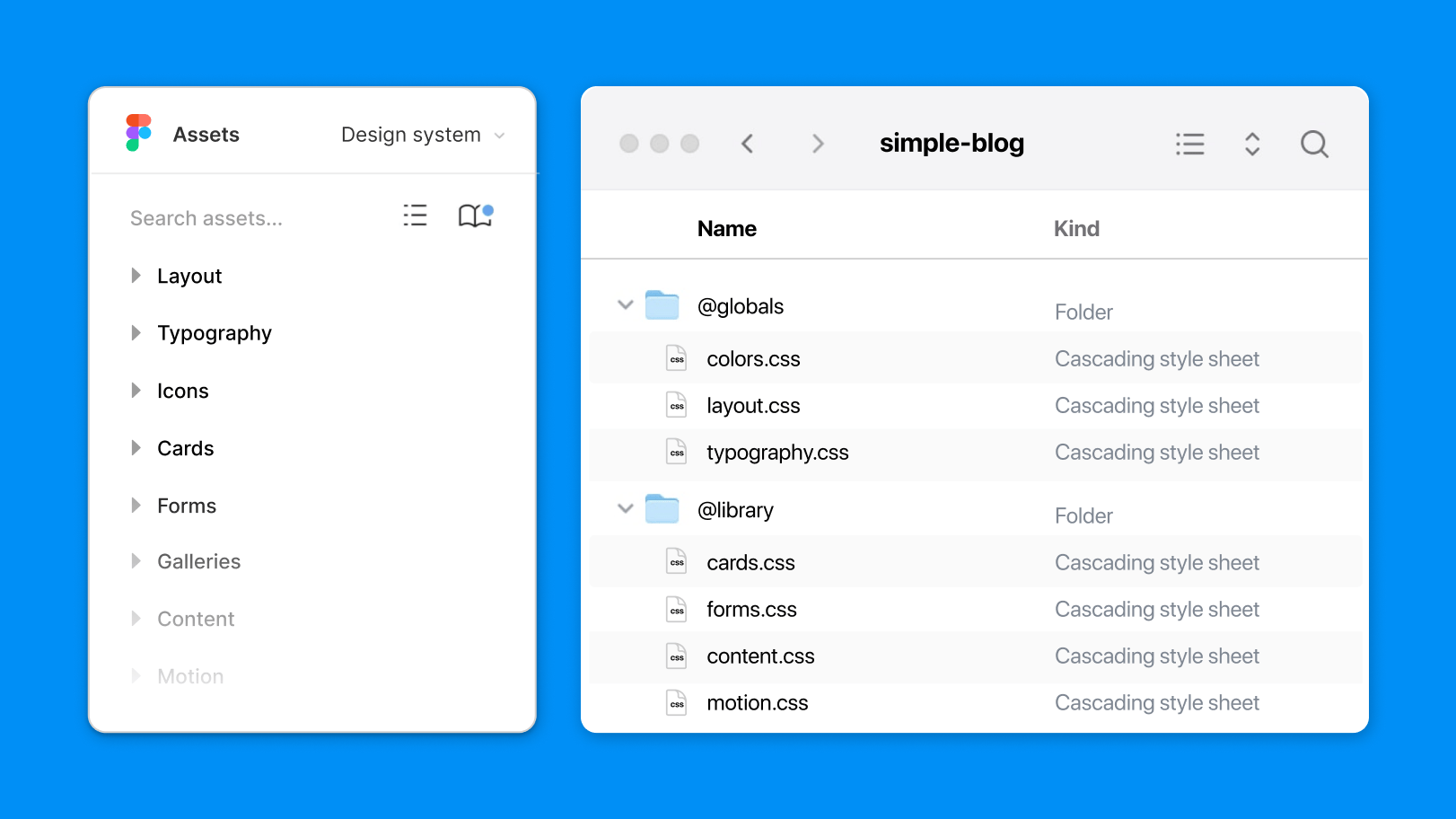
globals: ["@globals"]Global styles typically include:
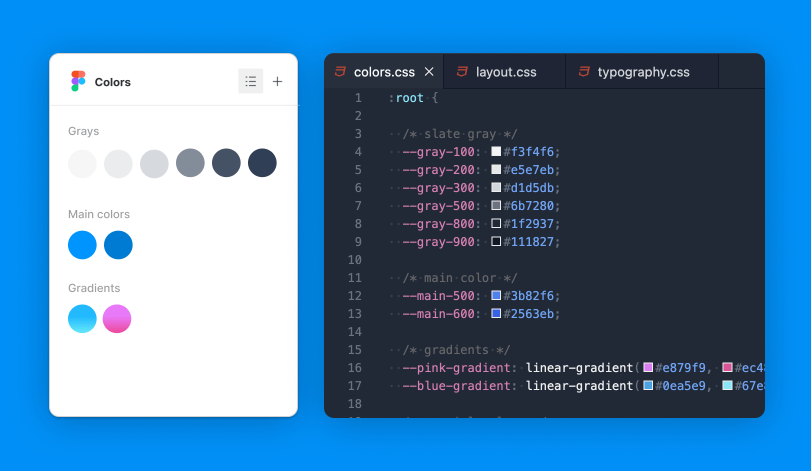
colors.css— Defines your brand palette, base colors like shades of gray, and accent colors.settings.css— Global resets, base styles, and CSS variables for colors, spacing, and other essential settings.elements.css— Universal styles for elements like links, images, tables, and other common elements.typography.css— Typographic styles for headings, paragraphs, text formatting, blockquotes, lists, and links.navigation.css— Styles for global navigation components, including headers, footers, and other key navigation elements.
The @ prefix for directory names is optional but serves as a useful convention to signify that the folder contains global assets rather than application-specific files like blog.
UI libraries
UI libraries are defined in your site.yaml configuration file like this:
libs: ["@library"]Unlike global styles, these styles are included on demand. Typical library files might include card.css or form.css.
Area-specific styles
In Nue, area-specific styles allow you to apply unique design elements to different sections of your site, such as a blog, documentation, or store. These styles override or refine global rules while still adhering to the overall design system, ensuring consistency across your site.
Area-specific styles are applied using the include statement in the .yaml file of the corresponding area folder. For example, in your blog app, you might include styles tailored specifically for that section:
# blog/blog.yaml
include: [ form, card, motion ]
When organizing your CSS with area-specific files, there is no need for class name prefixing (e.g., .blog .card). The styles within an area-specific file are automatically scoped to that section of your site, making class names like .blog .card redundant.
Page-specific styles
Page-specific styles give you precise control over individual pages, allowing for unique design treatments that do not affect the rest of your site. These styles are ideal for one-off pages like landing pages or special content that requires custom design.
To apply page-specific styles, use the include statement in the front matter of the .md file. For example:
# Front matter of the page
title: Announcing v2.0
include: [ dazzling-hero ]
This will include styles and components that match dazzling-hero
in their filenames, applying them only to this page without affecting any other part of your site. For example:
/* Styles for a page-specific hero section */
.dazzling-hero {
  background-image: url('/img/hero-background.jpg');
  padding: 4rem;
  text-align: center;
}
Section-specific styles
In Nue, section-specific styles allow you to divide your content into visually distinct sections for better readability and more control over styling. This approach works especially well for landing pages or long-form content where different sections require unique design treatments.
Splitting content into sections
By default, Markdown-generated HTML is placed inside an <article> element. For richer layouts, you can split your content into multiple sections using the sections configuration in your front matter or YAML files.
For example, in the front matter of a page:
---
sections: [hero, features, backstory]
---
This is an epic intro.
- Great design
- Stunning motion
- Awesome UX
Once upon a time...This would generate the following HTML:
<article>

  <section class="hero">
    <h1>Hello, World!</h1>
    <p>This is an epic intro.</p>
  </section>

  <section class="features">
    <h2>Features</h2>
    <ul>
      <li>Great design</li>
      <li>Stunning motion</li>
      <li>Awesome UX</li>
    </ul>
  </section>

  <section class="backstory">
    <h2>Backstory</h2>
    <p>Once upon a time...</p>
  </section>

</article>
Styling your sections
Once your content is split into sections, you can style each section individually using class names like .hero, .features, or .backstory. Since your styles are scoped to sections through the sections configuration, there is no need for redundant prefixes like .blog .hero. The section-specific styles are already applied only within that section's context.
/* Section-specific styles */
.hero {
  background-color: #f5f5f5;
  padding: 4rem;
  text-align: center;
}

.features {
  background-color: #e5e7eb;
  padding: 3rem;
  display: flex;
  gap: 1rem;
}

.backstory {
  background-color: #d1d5db;
  padding: 2rem;
  font-style: italic;
}
Automating section breaks
Nue can automatically split your content into sections based on <h2> headings. Each <h2> tag starts a new section, and the section is automatically assigned a class matching the heading (e.g., .hero, .features). This allows you to structure your content naturally without manually managing section breaks.
Alternatively, you can manually define section breaks using three dashes --- in your Markdown or YAML configuration for greater control.
Reusing section styles for consistency
To maintain design consistency across multiple pages, you can reuse the same section classes (like .hero or .features) on different pages. This ensures that similar content follows the same design patterns without needing to rewrite CSS for every page.
By consolidating section styles, your CSS remains clean and modular, ensuring consistency across your entire site while simplifying maintenance.