Layout Modules
Modern websites require consistent structural elements like headers, footers, navigation, and sidebars. Nue's layout modules provide a powerful approach to defining these components once and reusing them across your entire site.
Default HTML structure
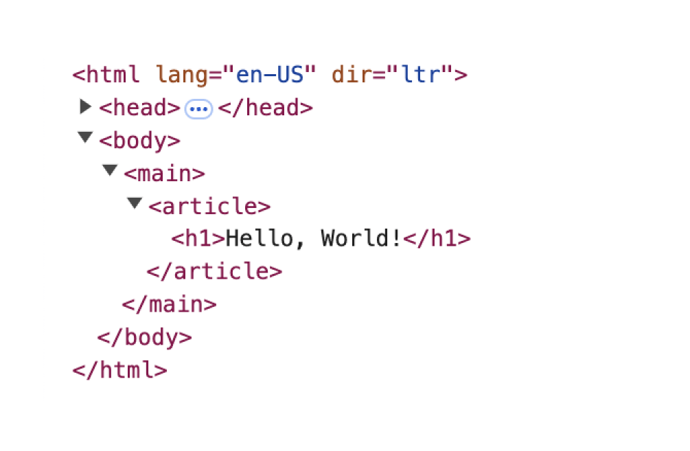
When you create a page in Nue, it automatically generates a semantic HTML structure around your content. Your Markdown is rendered inside this structure:
<html>
  <head>
    <!-- system meta elements -->
  </head>
  <body>
    <main>
      <article>
        <!-- your Markdown content -->
      </article>
    </main>
  </body>
</html>
Here's how this looks in Chrome DevTools for a simple page containing just # Hello, World!:

The Slot System
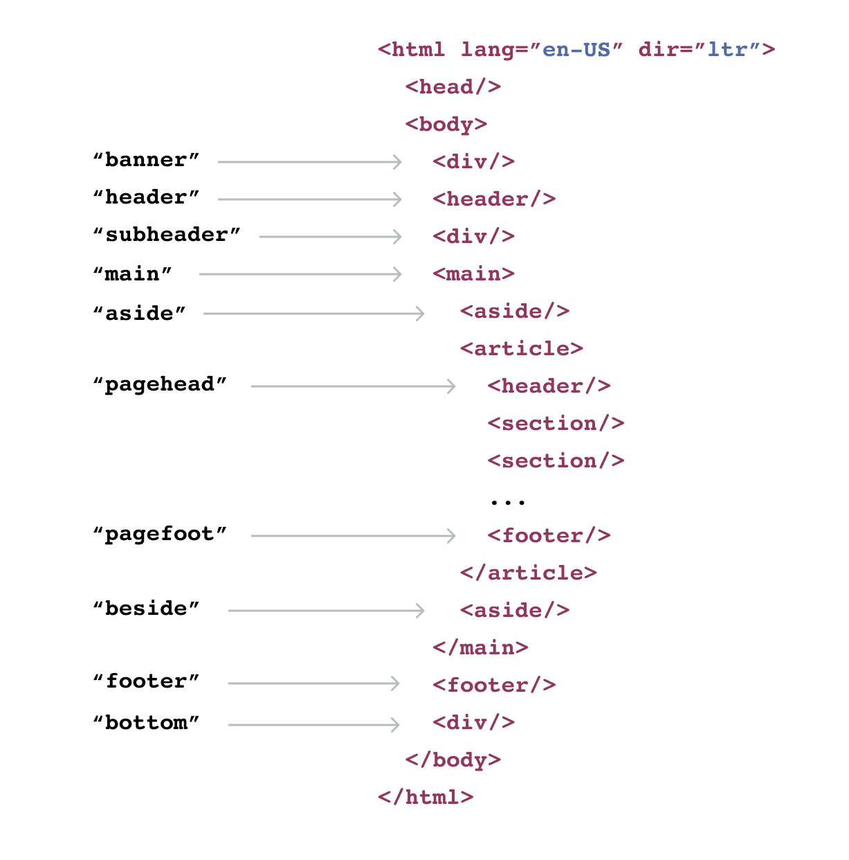
Nue uses a slot system to enhance this basic structure. Slots are predefined positions where layout modules can be inserted:

Common slots include:
| Slot name | Purpose |
|---|---|
banner | Temporary announcements above the header |
header | Global site header |
subheader | Breadcrumbs or secondary navigation |
main | Content inside the main element |
aside | Sidebars for documentation or catalogs |
pagehead | Hero areas for blog posts or marketing pages |
pagefoot | Call-to-action sections |
beside | Table of contents or complementary navigation |
footer | Global footer |
bottom | Overlays or menus below the main footer |
Creating Layout Modules
Layout modules are HTML templates that fill these slots. They use a syntax similar to regular HTML but with special attributes for dynamic content.
Basic Module Example
Here's a simple site header:
<header>
  <a href="/" class="logo">Site Name</a>
  <nav>
    <a href="/docs">Documentation</a>
    <a href="/blog">Blog</a>
    <a href="/about">About</a>
  </nav>
  <button popovertarget="menu">Menu</button>
</header>
For slots that aren't HTML5 landmarks, use the @name attribute:
<div ="banner">
<strong>Major update available!</strong>
<a href="/blog/release-2.0/">Check out v2.0</a>
</div>Core Layout Modules
Three special modules provide deeper control over your layout:
The Main Module
Control the structure inside <main>:
<main>
  <h1>Hello, World!</h1>

  <aside>
    <slot for="pagehead"/>
  </aside>

  <article>
    <slot for="content"/>
  </article>
</main>
The Root Module
Override the entire HTML document structure:
<html>
  <head>
    <slot for="head"/>
    <meta property="og:description" :content="og_description">
  </head>

  <body>
    <main>
      <h1>{ title }</h1>
      <slot for="content"/>
    </main>
  </body>
</html>
The Head Module
Add custom elements to <head>:
<head>
  <meta http-equiv="Content-Security-Policy"
Module Organization
Scope Levels
Layout modules can be defined at three levels:
Global: In a global directory, accessible throughout your site
Application-specific: Within an application directory, for that application only
Page-specific: In a leaf directory, for a single page
Module Location
Modules can be stored in any .html file. A single file can contain multiple modules — for example, your header, footer, and menu could all live in layout.html.
Overriding Modules
More specific modules override global ones. For example, a banner
module in your blog directory will replace a globally defined banner
module.
Disabling Modules
Modules can be disabled through YAML configuration:
aside: false
pagehead: false
pagefoot: false
This configuration can live in application YAML files or page front matter.
Template Syntax
Layout modules support an HTML-based template language that includes:
Dynamic data insertion
Loops and conditionals
Access to your site's data and metadata
For full details on the template syntax, see the template syntax documentation.
Through this system, you can build sophisticated layouts while maintaining clean separation between content, structure, and presentation. The HTML stays semantic, your content remains pure, and your design system handles the visual presentation.