DEPRECIATED:
See Styling
===
Nue CSS best practices
This document describes the best practices for writing clean CSS that is easy to maintain and scale. This is a result of decades of coding with CSS and HTML.
Less is more
The key take from this document can be squeezed into one sentence:
10 lines of code is easier to maintain than 100 lines of code
This website and Nue itself are a great demonstration of minimalism coming from practicing the following:
Constraints
Semantic HTML
External CSS
No CSS frameworks
No inline styling
These are all described in this document. Once you get familiar with minimalistic CSS coding, you are able to build entire websites with the same amount of code as you can find in CSS resets or Tailwind's base (preflight
) styles.
Respect constraints
When drafting your design system limit yourself to as few fonts, font weights, colors, variables, elements, class names and components as possible. This is beneficial for several reasons:
Easier to adopt — A simple design system is easier to adopt and use. The fewer variables and components you have, the harder it is to mess things up.
More creativity — By narrowing the possibilities you allow for the quicker production of work and encourage developers to make creative combinations with the available options. With no limits, there are unlimited possibilities, similar to the effect a blank paper can have.
Better consistency — If engineers can
do anything
, they definitely use their creative freedom to work against your design system. But when they can only use the stuff available you'll ensure the design goes as planned.Long-lasting products — Simple things last longer. The design decisions you make early on have long-lasting implications. Keep your design system simple and you are rewarded with great design and easily maintainable CSS code that lasts for future generations.
Links
Organize your CSS
Your CSS code is applied to a standardized HTML layout in the global design system. This CSS should be organized in such a way that the colors, elements and components are aligned with your design system.
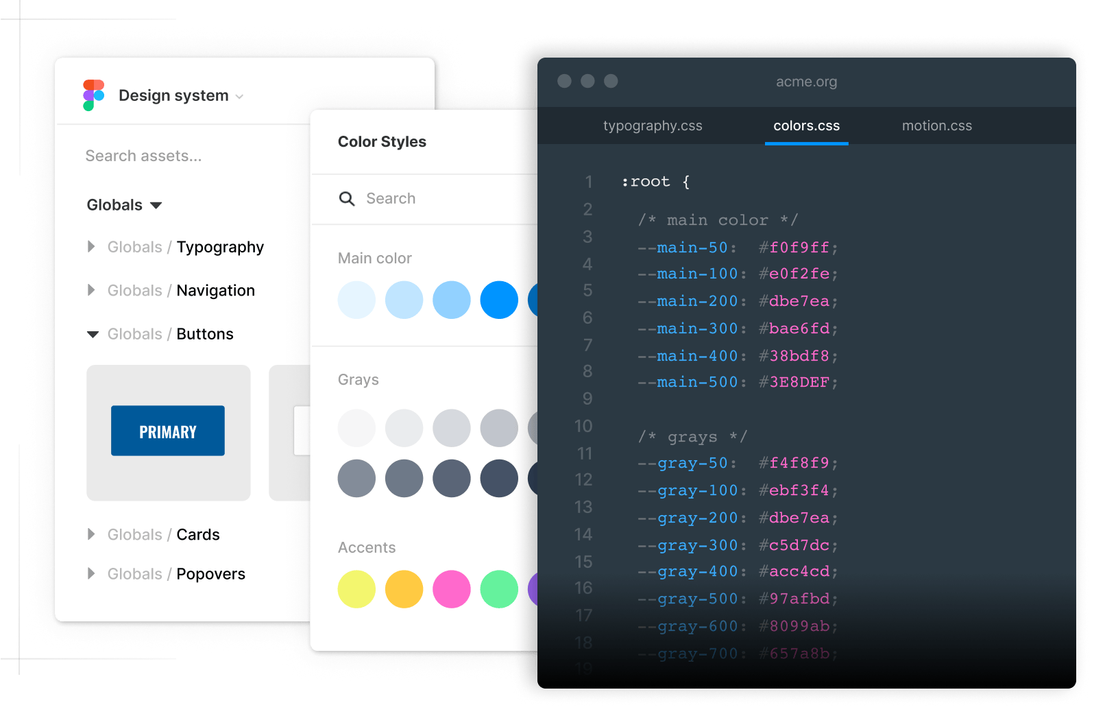
Name the files in such a way that everyone can easily guess what's inside the file. The elements in these files should be related and easy to discover even when a UX developer sees the codebase for the first time. For example:
typography.csshas all typographic elements like headings, paragraphs, text formatting, lists, links, blockquotes, etc.navigation.csswith settings for global header and footerform.csswith all form elements like inputs, text areas, select boxes, checkboxes, radios, sliders, etc.
Links
Setup CSS cascade
Split your design into globals, libraries, areas and pages for maximum re-usability and minimum duplication of code:
Globals
Put all the globally available settings and styles into a global directory. Things like colors, fonts, headers, footers, popover menus, and all the components that are shared across all the areas on your website.
Libraries
Place all your reusable code into a library directory. This code is something you want to explicitly include on your pages. Things like syntax highlighting, videos and settings for technical documentation can be shared by your blogging and documentation areas, but not everywhere on the site.
Areas
Place all area-specific CSS here. For example, a documentation area could set up sidebars and a fixed master header. These settings are specific to the area and not leaked to the global scope.
Pages
Place all page-specific CSS under the leaf folder, where the index.md file resides. These styles are only available for that single page only and are not used anywhere else.
More info:
Use simple selectors
One hugely important thing in the global design system is that you always know the exact page layout you are styling. This allows you to take advantage of the global scope and use the simplest CSS selectors possible without worrying about conflicts.
h1 { ... }
h2 { ... }
p  { ... }
a  { ... }
If you want to vary the styling between the global elements and the bulk of the code this is trivial to do with CSS nesting:
/* navigation stuff always in nav scope */
nav {
  a  { ... }
  hr { ... }
}

/* content always under article scope */
article {
  a  { ... }
  hr { ... }
}
Simple selectors make your CSS easy to read and maintain. They keep your file size small and allow using lower specificity on overrides.
Links
Specificity and Hierarchy in CSS
Write clean HTML
Avoid using unnecessary divs, spans and class names in your custom layouts:
<div class="chat-notification">
  <div class="chat-notification-logo-wrapper">
    <img class="chat-notification-logo" src="/img/chat.svg" alt="Chat icon">
  </div>
  <div class="chat-notification-content">
    <h4 class="chat-notification-title">ChitChat</h4>
    <p class="chat-notification-message">You have a new message</p>
  </div>
</div>
Instead, you should write clean and semantic HTML:
<div class="notification">
  <h3>ChitChat</h3>
  <p>You have a new message</p>
</div>
Clean HTML is significantly easier to read and work with. Use a class name only on the root element and let CSS selectors do the rest. It's surprising how little class names you need with clean, semantic markup. This website, for example, has only four class names on the global scope: grid
, card
, stack
and note
. Global namespace pollution
is essentially a myth and is trivial to avoid.
Create reusable class names
Always find ways to extract reusable pieces from your CSS code. For example, the above notification component could be written as:
<div class="notification card">
  <h3>ChitChat</h3>
  <p>You have a new message</p>
</div>
Here, the component was broken into two pieces: A highly reusable card
component and a notification-specific notification
component:
/* styles for all cards */
.card {
  box-shadow: 0 0 2em #0001;
  border: var(--border);
  border-radius: .5em;
  padding: 1.5em;
  font-size: 95%;
}

/* notification-specific styling */
.notification {
  background: url(/img/chat.svg) 10% center no-repeat;
  background-size: 3rem;
  padding-left: 6rem;
}
Now the card
class can be applied to any element or component you desire, reducing code duplication and making a smaller and clearer codebase.
Links:
Nicolas Gallagher: Component Modifiers
Links
Form follows function
One killer feature of external CSS is the ability to use the same markup, but a different stylesheet depending on the context. You could, for example, create a dedicated style for technical content and another for marketing content and include one or another depending on the context:
technical-content.cssfor documentation and blog entries. These styles focus on efficient information delivery and include extra styling for tables, syntax highlighting and API docs.marketing-content.cssfor the front page, customer cases, and feature tours. This has a moreheroic
tone with more prominent headings and more complex layouts.
Form follows function is a principle of design associated with late 19th- and early 20th-century industrial design, which states that the shape of a product should primarily relate to its intended function or purpose. Global design system together with external CSS is the perfect demonstration of this principle in a modern web stack.
Links
Prefer standard HTML
Don't create a custom component for every possible situation where a standard HTML element would do the same job just fine. For example, the text components in Tailwind Catalyst: <Description>, <DialogDescription>, <Text>, <AlertDescription>, etc. could be all implemented with a single <p> element that is externally styled.
Standard HTML helps you avoid component overload — a situation where you are constantly creating new components. It's not unusual to see massive codebases with hundreds, even thousands of components. Don't do that. Use semantic HTML and keep your codebase clean and lean.
Avoid CSS reset libraries
Avoid CSS reset libraries. They just add extra complexity and baggage with very little value. First, you set everything to zero and then reset it to something you desire. It's better to only implement what's included in your design system and that's all you need. The only CSS reset you need is this:
*, *::before, *::after {
  box-sizing: border-box
}
This sets your CSS box model globally to border-box
, which makes dealing with the sizes much easier and eliminates several issues while laying out your content.
Avoid CSS frameworks
Avoid CSS frameworks. They just add extra layers of complexity and very little value. Once you've created your design system, and know exactly what you're doing, the CSS comes naturally. Any 3rd party library is just on your way by adding tons of things you don't need. For example, Bootstrap 4 has around 9000 lines of CSS, which is orders of magnitude more than what is needed for this website. Minimalism might be the most undervalued development skill.
Avoid CSS-in-JS
CSS-in-JS was introduced in 2014 to solve the problem of a global namespace in Facebook's gigantic, PHP-based codebase. However, this is a non-issue in well-organized CSS architectures.
A much better solution is to respect constraints and centralize your CSS for developers who care about UX. Having 5-15 carefully named components does not pollute anything. Instead, you'll create a library of reusable components that match your design system.
Prefer CSS over JavaScript
Modern CSS is surprisingly powerful. Things that used to require JavaScript can now be expressed with nothing but CSS:
Popover menus
Scroll linked animations
Smooth scrolling
View transitions
Check motion and reactivity for details.
Learn modern CSS
There is tons of misinformation about CSS that makes beginner developers move away from web standards and adopt the idea of inline styling.
But if you grasp the power of the global design system and see how you can accomplish the same thing with significantly less effort, you begin to think, why you ever bought the idea of tight coupling in the first place.
Understand the power of constraints, design systems, and web standards. Become a professional UX developer and stay relevant for years to come.