Nue 1.0 (Beta) — A web framework for UX developers
Exactly one year ago I decided to create a super simple website generator targeted for the following people:
UX developers: who natively jump between Figma and CSS without a confusing designer-developer handoff process in the way.
Beginner web developers: who want to skip the redundant frontend layers and start building websites quickly with HTML, CSS, and JavaScript.
Experienced JS developers: frustrated with the absurd amount of layers in the React stack and looking for simpler ways to develop professional websites.
“Nue is exactly what I want. As a technical founder, I need easier ways to build websites. I don't want to hire devs and watch all my profits disappear in salaries.”
— Alan Hemmings / BigNameHunter / CEO
Designers: planning to learn web development, but find the JavaScript ecosystem too scary
Parents & Teachers: who wants to educate people how the web works

What's new?
v1.0 Beta is by far the biggest release yet with five months of work and over 500 files changed. This is a breakdown of new features, updates, and breaking changes.
Improved CSS stack
Nue has a powerful CSS theming system that supports hot-reloading, CSS inlining, error reporting, and automatic dependency management. This version improves the system with the following features:
Lightning CSS is now enabled by default allowing you to use CSS nesting, color-mix, and other modern features now without browser-compatibility concerns.
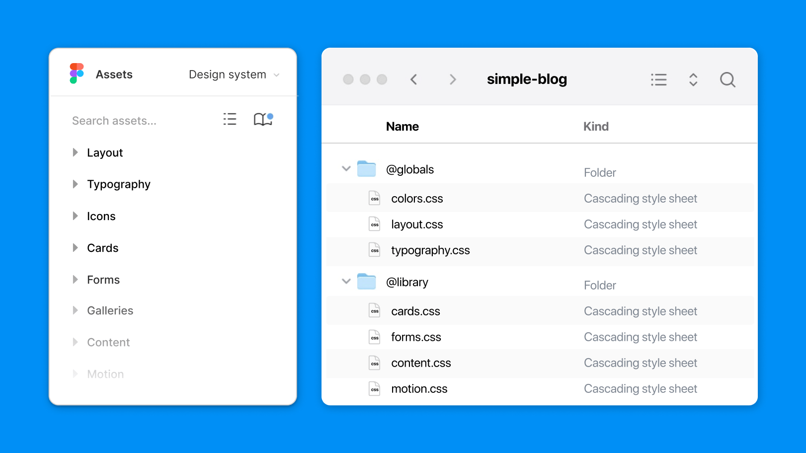
Library folders to hold reusable CSS which can be explicitly included on your pages with a new
includeproperty. You can include assets globally, at the application level, or page level. This helps you take maximum advantage of the CSS cascade.Exclude property allows you to strip unneeded assets from the request and lighten the payload.
CSS view transitions
View transitions are an important part of a seamless user experience and are a key feature in the Nue framework. They can now be enabled with this simple configuration variable:
# enable animated page switches globally
view_transitions: true
This option was previously called router, but this feature is now much more than just a router. It now triggers a view transition effect that you can customize with ::view-transition CSS pseudo-element. This website, for example, has a scale down
transition effect on the page's article element. It's defined with this compact CSS:
article {
  view-transition-name: article;
}

/* view transition (scales down the old article) */
::view-transition-old(article) {
  transform: scale(.8);
  transition: .4s;
}
Nue's view transition mechanism implements a simple diffing algorithm to check which parts of the page have been added, changed, or removed and updates the page accordingly. This helps you take advantage of the CSS @starting-style at-rule to trigger animations when the page sections are updated. The non-updating elements stay in place. You can see this in action when you click the sidebar elements under the new documentation area.
View transitions is a broad standard with tons of visual possibilities that are yet unexplored. Nue helps you stay in the forefront CSS development.
CSS best practices
Nue's new CSS best practices brings out the best of modern CSS:

These lessons focus on writing reusable CSS that is easy to read, maintain, and scale. It unpacks decades of CSS experience with a heavy focus on clarity and minimalism. In fact, all the lessons can be squeezed into this one sentence:
10 lines of code are easier to maintain than 100 lines of code
Nue helps you build professional websites with the same amount of CSS as you can find on a typical normalization library or Tailwind's preflight
CSS.
New website and documentation
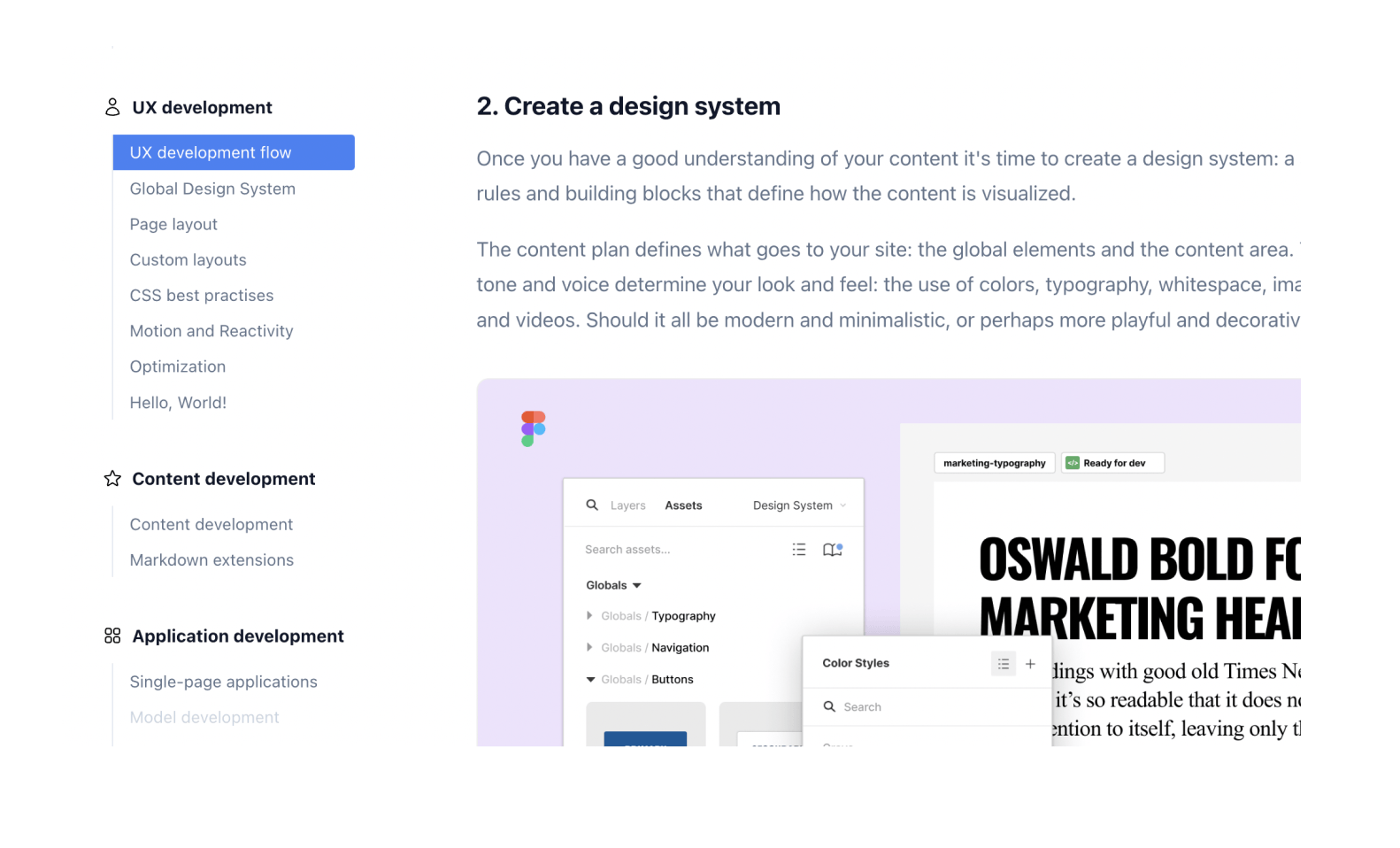
Unsurprisingly, the biggest job was the documentation area, which now focuses on Design Engineering. About 80% of the documentation is completely rewritten and there are several new documents.

The most important thing, however, is that the website is generated with the public Nue version, forcing us to eat our own dogfood
.
Easier setup
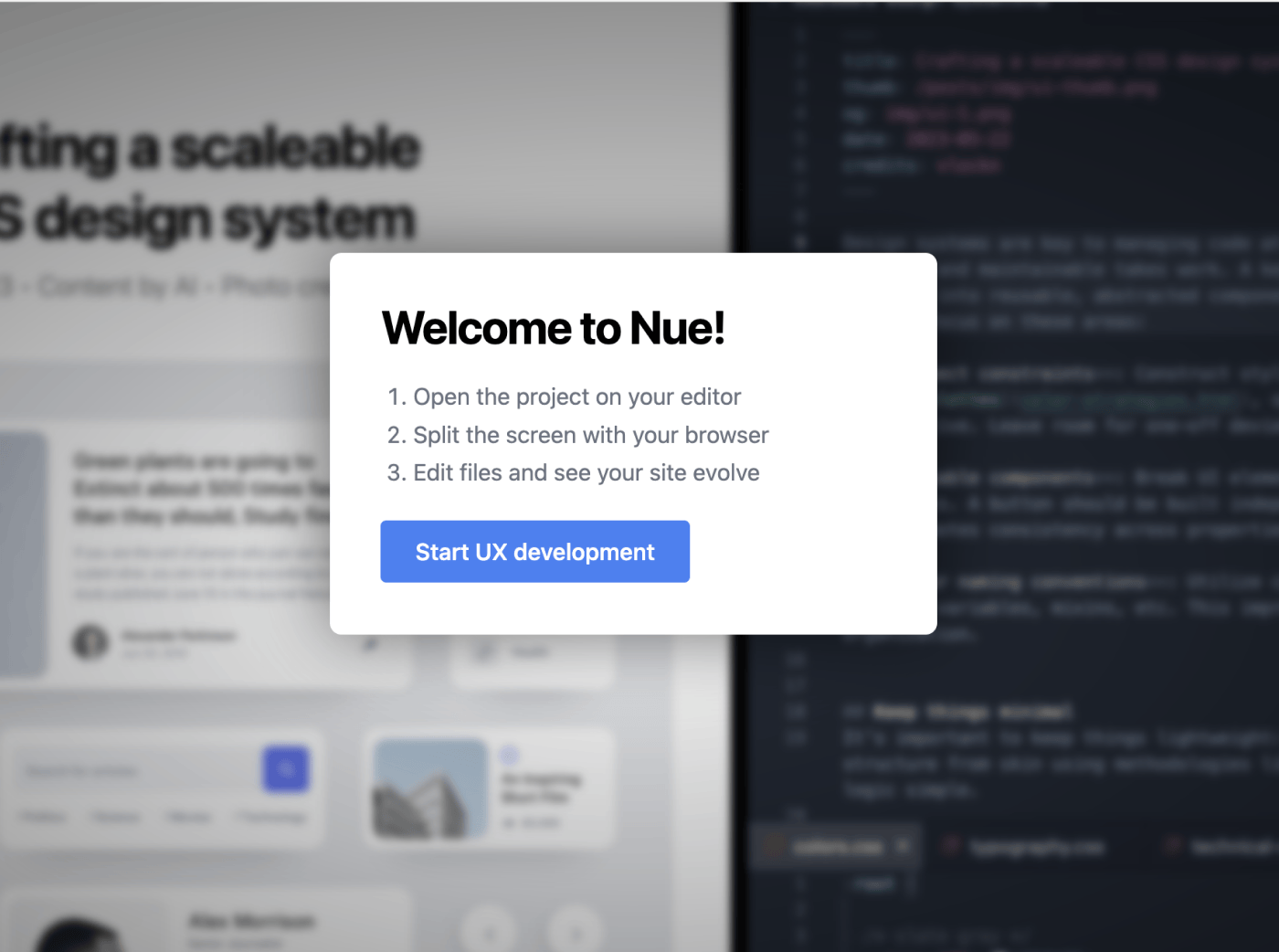
Nue installation is now simpler, and the onboarding now comes with a handy nue create command that installs an example website and opens it on your browser. The opening screen looks like this:

The setup is supported by a tutorial that explains how Nue and UX development works.
Smaller updates
Freeform file naming
There are no longer hard coded app.yaml, layout.html, or main.js file names to give them a special meaning. You can now freely name your CSS, YAML, JavaScript, or HTML files. You can also have multiple data and layout files, and they are all grouped or concatenated together. You could, for example, create a layout.html file for layout-specific components and a components.html file for other server-side components.
Dynamic sections and grid items
The section_component option has been deprecated
You can turn your sections and grid items into a native Web Component. For example, on the front page of this website, we have a scroll-transition
component to help implement all the scroll-triggered CSS transitions.
section_component: scroll-transitionThe web component can be assigned globally in site.yaml for all page sections or it can be assigned on the area level, or at the page level (in the front matter).
Miscellaneous new features
New
<navi>,<markdown>,<pretty-date>, and<toc>tags to help build custom layoutsA new
<gallery>tag to render content collectionsInline SVG support: You can inline your SVG files with a new inline attribute. For example:
[image /img/my-animated.svg inline]. This allows you to control the image and its transitions/animations with CSS.Files with a
.htmsuffix are treated as client-side components. Now both.nueand.htmfiles are treated the same.Blog entries are now sorted by both
pubDateand a new, shorterdateproperty.You can use both
og_imageand a new, shorterogproperty to assign an open graph image for the page.
Breaking changes
The major version number goes from zero to one, which means that this version of Nue is not backward compatible. There are the following changes that might break your HTML or CSS from working:
The former
css_2023configuration is now callednative_css_nesting, which attempts to more accurately describe what it does: Using native CSS nesting. Setting this totruegenerates a smaller CSS output, but is not supported by the oldest of browsers. Check the current Can I Use statistics for details.Syntax highlighted blocks are no longer marked with a
glowattribute so you must change your[glow]CSS selector topre. This change is in line with our goal to strive for a more standards-based HTML layout without exotic class or attribute names.Selected navigation links are no longer marked
activeattribute, but witharia-selectedattribute to make them more compatible with the HTML standard.HTML generated with the
[image]Markdown extension (ortag
) now always has a<figure>-tag as the parent element to make it easier to style the differentfigure,img,picture, andfigcaptioncombinations.The content is always wrapped inside a
<section>element, even if there is only a single section on the document. This always generates the same markup so it's easier to style.Dropped the
[icon]tag due to lack of usage. Use the more generic[image]tag instead.Fenced code blocks can now be assigned with a class name as follows:
 ``` .blue
 <p>the code here is rendered bigger</p>
 ```
This will nest the generated <pre> element with a wrapper element like this:
<div class="blue">
  <pre>...</pre>
</div>
Previously the class name would be set directly to the pre element. This makes a more consistent behavior with the [code] tag.
Try now!
Please try it out and experience the difference in UX development. You might wonder why you ever built websites any other way.