Introducing Glow: Markdown code blocks for CSS developers
Today we're launching Glow — a new take on syntax highlighting:
Glow is different: Rather than parsing language internals, Glow focuses purely on aesthetics and the visual style of your code.
Glow is simple: With just a few CSS variables, Glow adapts all languages to match your brand colors effortlessly.
Glow is small: Glow is significantly smaller than mainstream alternatives — around 5KB compared to 5MB. It’s the most compact implementation available.
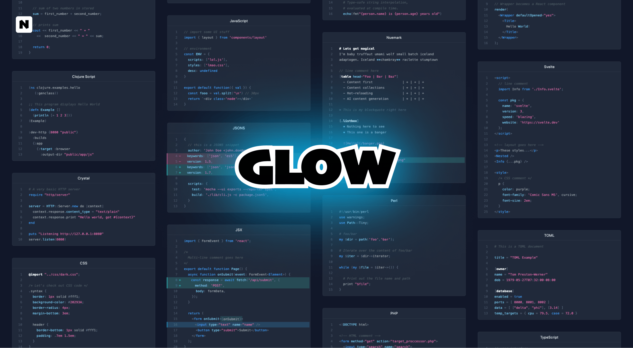
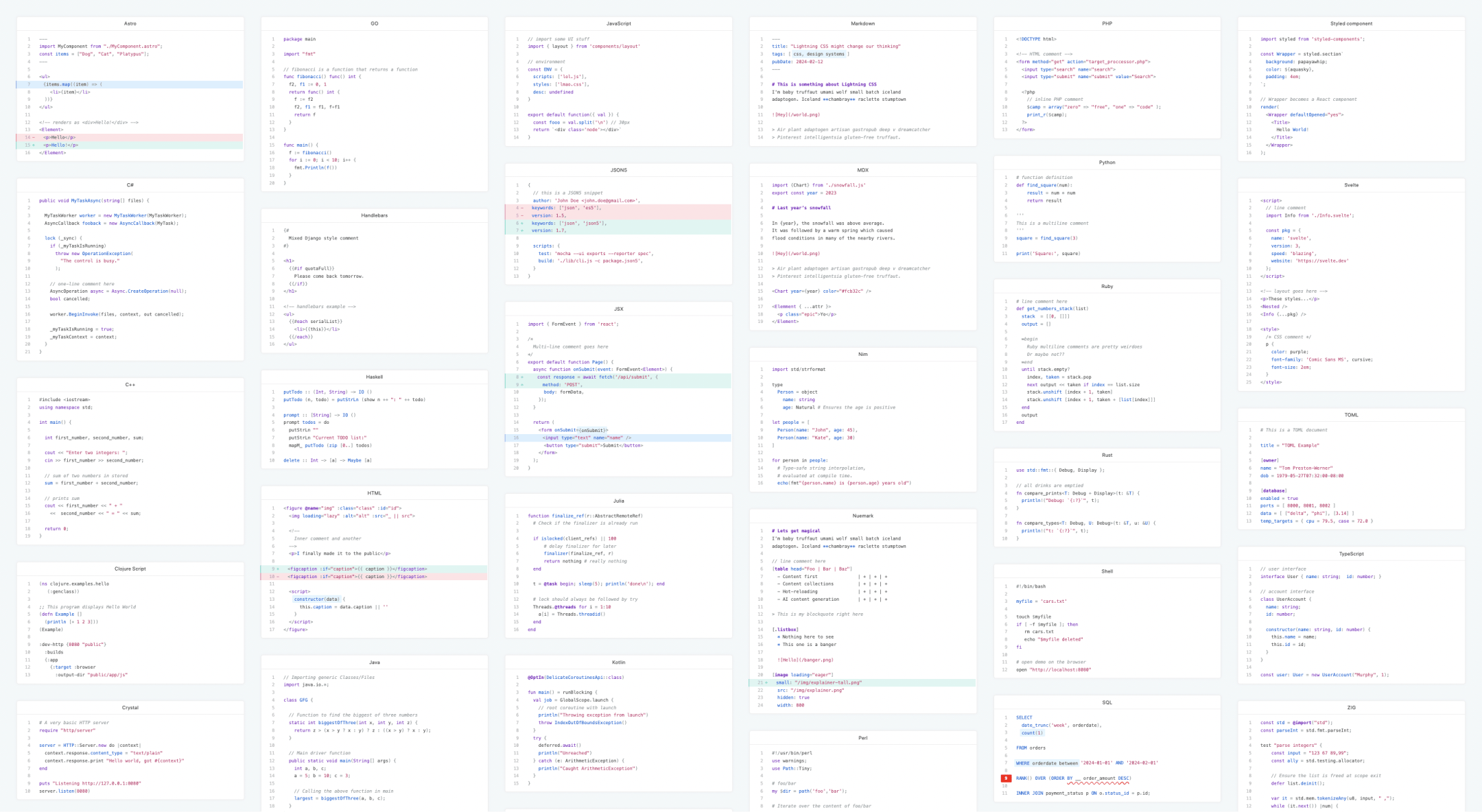
Coloring voodoo
Be it Haskell, TypeScript, or Zig. React, Vue or Svelte. Whatever Turing-free Markdown artifact is mixed with another tightly coupled language-of-the-day oddity. And they will all glow:
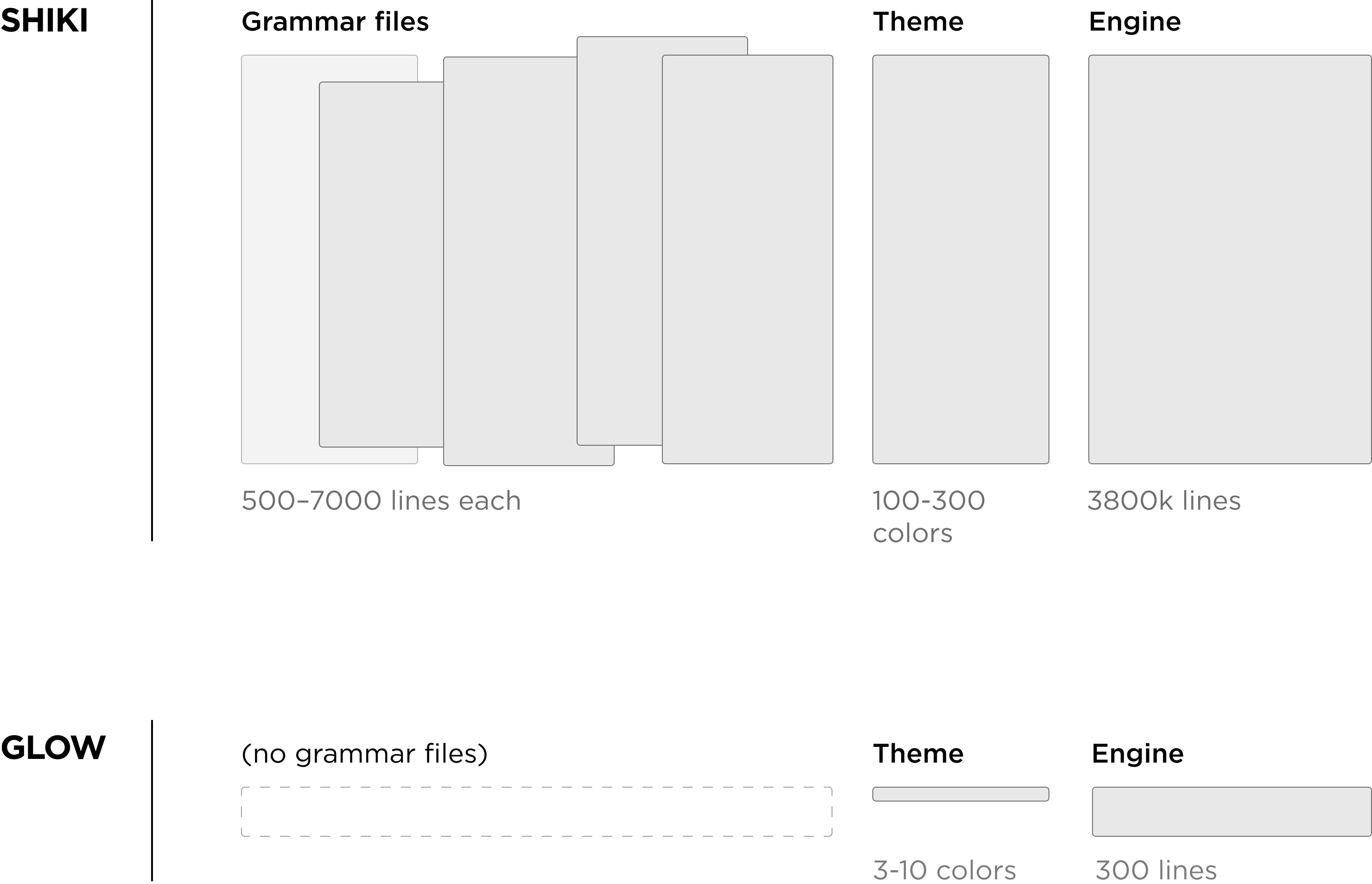
Contrast this to grammar-aware highlighters like Shiki, where it's a large programming effort to add a new language to the mix. For example, the golang.json grammar file has 2700 lines, and javascript.json is a whopping 6000-line configuration file.
Easy brand coloring
If you look at the most recognizable brands on the internet, you'll notice that 80% of them are based on a single brand color. It is often coupled with a secondary color and a complementary accent color. This is exactly how Glow works. You can make the code blocks compatible with your brand just by adjusting a handful of CSS variables:
/* brand-aware CSS variables*/
:root {
  --glow-primary-color: #7dd3fc;
  --glow-secondary-color: #4f72b6;
  --glow-accent-color: #419fff;
}
It's a no-brainer to create new themes, both light and dark, after which all languages will automatically adapt your brand colors. No missing color tokens, no surprises.
Contrast this to grammar-aware theming systems, like Shiki and Prism, where a single theme can have hundreds of color variables. Monokai theme, for example, has 140 color variables, and Material theme has a whopping 296 variables. It's a huge development effort to build a new theme that works reliably across languages.
Unlimited possibilities
Glow's unique, classless design system gives you line numbers, selections, error highlights, insertions, deletions, and much, much more.
<script>
  // imports
  import { longpress } from './longpress.js';

  let pressed = false;
  bet glow_market = 9999_99++;
</script>

<label>
  <input type=range bind:value={duration} max={2000} step={100}>
  {duration}ms
</label>

<button use:longpress={duration}
   on:mousedown="{() => pressed = true}"
   on:longpress="{() => pressed = true}">Press me</button>

<!-- condition -->
{#if pressed}
  <p>Yoou pressed and held for {duration}ms</p>
{/if}

<style>
  /* button style */
  [role="button"], button {
    background-color: var(--main-color);
    color: #899;
  }
</style>
And when I say unlimited
, it means that:
Writing future CSS today has been a massive
productivity boost. You'll get nesting, `color-mix()`,
variables, and whatnot. Natively, today.

> After I ditched all tooling I was able to
> work closer to metal. Everything happened
> sub-millisecond. I entered a new planet.Using together with Nue
Nue is a web framework specializing on UX development. As of today, it has built-in support for Glow. You can easily extend your Markdown with stacks of code blocks or tabbed code panels. For example:
Get started with Glow
You can try Glow either as a standalone library or together with the Nue framework.
Standalone library
Install nue-glow with npm, pnpm, or bun:
npm i nue-glowAnd follow the Glow documentation
With Nue
Try Glow with Nue as follows:
# Install Bun (if not done yet)
curl -fsSL https://bun.sh/install | bash

# Install website generator (Nuemark playground)
bun install nuekit --global

# Start a Nue project with a Glow-powered template
nue create simple-blog
Now you can enjoy goodies content hot-reloading when the code blocks are edited: