Hyper: Standards first React alternative
Note
Hyper was an early preview of what became Nuedom. The syntax here is a bit different, but the core ideas remain the same.
Hyper is a standards first markup language for building user interfaces. It enables developers (and AI models) to generate complex UIs with amazingly clean syntax.

Project goals
Standards first: User interfaces should be assembled with HTML, styled with CSS, and enhanced with JavaScript.
Simplicity: UI composition should be easy and require as few idioms and abstractions as possible, both on client and server (SSR).
Design Systems: Design should be a separate subsystem, easily accessible for developers who care about and understand design.
Scalability: Complex UIs should retain simplicity as the application grows.
To understand how these goals are met, we use React as a counter-example because it's the opposite of Hyper's architecture and design goals. React embraces a monolithic architecture where logic, structure, and styling are mixed together, while Hyper is what React 1.0 (2013) originally envisioned: just a headless view layer.
Let's study the difference in more detail:
Simple components
Below is a basic <table> component defined in three ways:


Modern React Modern React represents a common approach to building user interfaces today using component libraries such as ShadCN/UI, Material UI, Chakra, or Tailwind Catalyst. In this example, we chose ShadCN as it's gained significant popularity in recent years and has strong AI tool support. For example, Claude and ChatGPT offer built-in support for ShadCN in their code previews. Source • Demo
Old school React is how React components were built back in the days when styling was decoupled from the component code. Source • Demo
Hyper demonstrates the standards-first approach. Source • Demo
While these differences might seem minor, they become apparent when we move to more complex components:
Complex components
Next we examine how these approaches handle increasing complexity. Here's the same table component, but now with sorting and filtering:


Modern React is assembled according to ShadCN's data table documentation. The bundled JavaScript is 91.3KB. Source • Demo
Vanilla TSX uses
useStateanduseMemoto implement the added functionality, and the HTML is tagged the old school way with numerous class names.Hyper uses semantic HTML with minimal class names and two instance methods for sorting and filtering. The resulting JS is only 3.9KB minzipped (1.2KB + 2.7KB for hyper.js). Source • Demo
Design systems
Here's an example dashboard assembled with Hyper:

Here is the same dashboard, but with Ramsian
look and feel:

This transformation required zero changes to component code. Just a 32-line CSS file extending the base design system. Demo
Modern React: tightly coupled design
This kind of design swap becomes a large programming effort when design choices are coupled into components via CSS-in-JS or Tailwind. For example, in ShadCN, to change the typography of your headings, you need to edit alert-dialog.tsx, alert.tsx, card.tsx, dialog.tsx, drawer.tsx, and sheet.tsx. This requires understanding of idioms like data-slot, {...props}, cn(), clsx(), and twMerge(). Here's the code for the title and description elements:

Tight coupling can also create a maintenance issue. For example, ShadCN's New York
theme duplicates their default theme, resulting in 40,000+ lines of additional TSX code to maintain.
While you definitely can decouple your styling from your React components, this pattern is rarely seen in real-world applications. Instead, the use of vanilla CSS is often discouraged due to concerns about global namespace pollution
or other reasons.
Hyper: decoupled design system
By contrast, Hyper colocates your typography concerns into a single CSS file, acting as the single source of truth for your h2 an p element styling:
// typography.css
globals {
h2 {
font-size: 1.125em;
font-weight: 500;
}
p {
color: var(--base-500);
text-wrap: balance;
line-height: 1.5;
}
// all typography rules "colocated" here
}This solves three key issues in modern React:
Truly reusable components across projects and styling contexts
Central design system easily maintainable from the same place
Zero boilerplate due to strict separation of concerns
Nue actually enforces you to external design system. Tight coupling in any form: CSS-in-JS, class name abuse, component-specific <style> elements, inline style attributes, or cryptic class name values like size-[max(100%,2.75rem)] are systematically eliminated.
Scalability
Here's how simplicity scales: a full-scale app lighter than a React button:
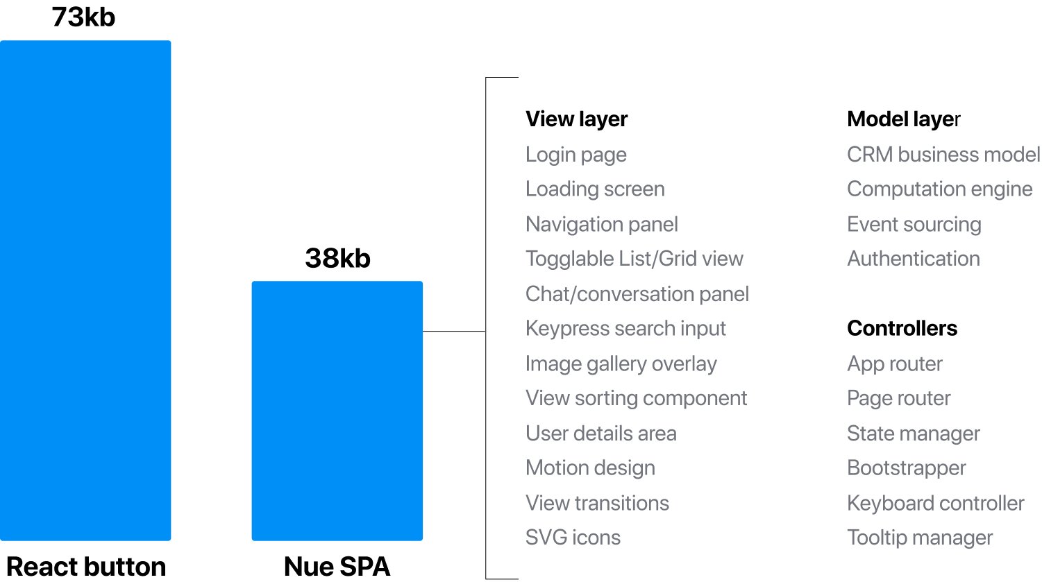
Your application starts simple, and remains simple as the project grows. Source • Demo
FAQ
How is this different from Svelte and Vue?
While Svelte and Vue both offer a more lightweight development environment than React, they still diverge from Hyper's standards-first vision. Though they provide better separation of concerns with their component structure, many popular patterns in these ecosystems still encourage coupling design with components through scoped CSS, CSS-in-JS libraries, or Tailwind integration.
What is Nue?
Nue is a website/webapp generator based on Nue JS templating. Hyper is the next evolution of Nue JS, which it will replace. All Nue projects reside under the same monorepo.
Isn't this just another framework?
Hyper takes a different approach than what this question suggests. Rather than adding to the ecosystem of tools and abstractions, Hyper aims to reduce tooling and complexity by returning to web standards. It eliminates the need for many specialized frameworks, libraries, and practices that have emerged to solve challenges within the React ecosystem. Our goal is to offer a simpler path reducing the need for constantly learning new frameworks and tools.
Why are standards so important?
Standards offer significant long-term benefits:
Timeless skills: Knowledge of HTML, CSS, and JavaScript fundamentals remains valuable across decades, while framework-specific knowledge can become outdated.
Sustainable products: Applications built primarily with web standards tend to require less frequent and less disruptive rewrites.
Consider how React's ecosystem has evolved over time: Class components gave way to hooks, state management shifted from Redux to Context to various alternatives like Zustand and Jotai, and styling approaches continue to evolve from Styled Components to Emotion to CSS Modules and beyond. Each shift requires developers to learn new patterns and often refactor existing code.